Wednesday, January 23, 2008 at 5:14 PM
by Geoff Pike, Google Finance 20% Engineer
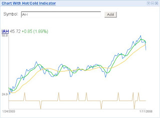
Inspired by the entertaining and informative Google Finance tab for iGoogle, I created a charting gadget that displays bigger charts with a light dose of technical analysis. I can't claim great knowledge of (or success with) said analysis, but I like to look at moving averages and occasionally other indicators computed from recent price and volume action.
The details: weekly price and volume data come from Google Finance; prices are plotted on a log scale, with 10- and 40-week moving averages; and a "hot/cold" indicator is presented at the bottom of the chart. A security is deemed "hot" if its price was up three straight weeks with increasing volume each week. (Alternately, a security is marked "cold" if it was down for the same interval.) Prices are plotted in blue, with green for the 10-week, and yellow for the 40-week moving averages. This gadget works only on iGoogle.
My gadget is not an official Google gadget -- it's more like a fun experiment. Comments are welcome! Or, if you'd like to write your own charting gadget, take a look at my source code and the Google Chart API documentation.
